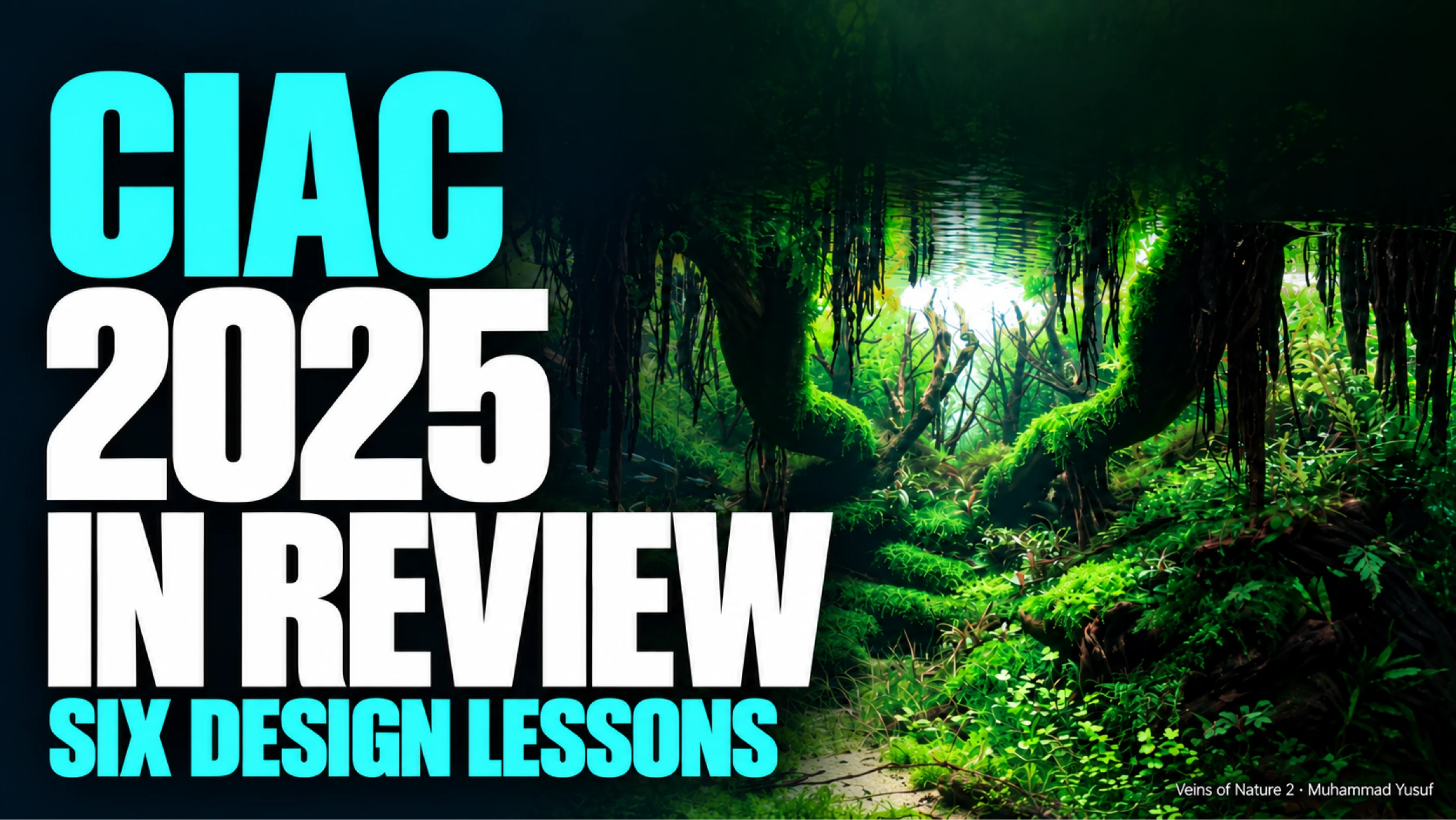
This CIAC 2025 review brings together six works from the Aquascaping Group, spanning first to nineteenth place. Each offers a different lesson: guiding the eye through wood, protecting open space, using plant colour, arranging rock, shaping atmosphere with light, or giving fish a meaningful place in the image.
The selection is an editorial reading of the published photographs, rather than an explanation of the official scores. Explore the CIAC 2025 gallery alongside this article, then follow the linked AquaRank profiles to discover the people behind the layouts.
1. Build a route through the landscape
Veins of Nature 2 — Muhammad Yusuf, Indonesia — CIAC 2025, Rank 1

Veins of Nature 2 — Muhammad Yusuf — CIAC 2025, Rank 1. Published contest photograph from the AquaLibs archive.
Muhammad Yusuf's winning aquascape makes a dense forest feel navigable. Large wood forms occupy the foreground, hanging roots interrupt the upper space, and a brighter opening draws attention into the distance. The eye has obstacles to travel around, but it also has a destination.
The curved wood establishes continuity between the near and far parts of the scene. Planting softens its surfaces while leaving enough of the structure visible to preserve that movement. The restrained sandy opening at the front provides an entrance into a landscape that might otherwise feel closed.
In his official CIPS interview, Yusuf identified the Petungkriono rainforest in Central Java as his inspiration. That context helps explain the scene's sense of enclosure and discovery.
The design lesson: establish a visual route before adding detail. Follow the main wood lines with your eye: do they carry you into the composition, or stop against unrelated objects?
For 2026: will the strongest forest layouts offer a fresh spatial experience as well as impressive construction?
Explore Muhammad Yusuf's AquaRank profile.
2. Give the empty space a shape
The Pulse of Life — Gang Zhao, China — CIAC 2025, Rank 2

The Pulse of Life — Gang Zhao — CIAC 2025, Rank 2. Published contest photograph from the AquaLibs archive.
Gang Zhao, listed as Zhao Gang in the official interview, gives the central opening as much importance as the rock around it. Projecting shelves divide the scene into overlapping levels, while the pale background remains visible through a narrowing passage.
This negative space has an irregular outline. It changes width as the surrounding forms move forward and recede, giving the canyon a stronger sense of depth than a straight, uniform gap would provide. Dark undersides make the brighter planted surfaces appear more prominent.
The official judges' comments also discuss the layout's spatial structure. They include criticism of some planting details, a useful reminder that a highly placed work can still offer opportunities for refinement.
The design lesson: sketch the open space as carefully as the hardscape. Its contour, interruptions and connection to the foreground help determine how the whole aquarium reads.
For 2026: how will designers keep ambitious rock structures readable once the planting fills in?
Explore Gang Zhao's AquaRank profile.
3. Use plant colour to connect the composition
Eternal Blaze — Rahul Mukherjee, India — CIAC 2025, Rank 6

Eternal Blaze — Rahul Mukherjee — CIAC 2025, Rank 6. Published contest photograph from the AquaLibs archive.
Eternal Blaze places warm tones within a predominantly green landscape. Reddish planting appears across the upper background and in smaller accents through the middle, creating connections between areas separated by wood and shadow.
The colour is effective because it has a supporting structure. Sloping wood and planted surfaces carry the eye through the scene; the warmer accents reinforce those relationships. Broad leaves, fine growth and moss-like textures also prevent the green areas from becoming a single visual mass.
The photograph shows how colour and texture can work together without making every planting group equally conspicuous. It does not establish the species used or the conditions that produced those colours.
The design lesson: decide where colour should lead attention. A repeated accent can connect the foreground, middle and background more effectively than one isolated patch added for contrast.
For 2026: will warm planting become an essential part of more compositions, or remain a finishing accent?
Explore Rahul Mukherjee's AquaRank profile.
4. Make the rocks share a direction
Takachiho Gorge — Gustavo Pimenta do Nascimento, Brazil — CIAC 2025, Rank 10

Takachiho Gorge — Gustavo Pimenta do Nascimento — CIAC 2025, Rank 10. Published contest photograph from the AquaLibs archive.
Takachiho Gorge is a useful contrast to the more enclosed forest scenes. Its central rock mass projects above smaller surrounding forms, with dark exposed faces set against bright planting and a pale opening behind.
The stones differ in size, but several sloping edges create a related directional rhythm. Smaller rocks and low planting carry that rhythm into the foreground. A pale channel travels between these forms, helping the eye move from the front towards the brighter distance.
The vegetation leaves important rock faces visible. That restraint matters: covering every surface would weaken the shapes that give the landscape its character. The alternation of exposed stone and planted pockets gives the viewer enough information to read the terrain.
The design lesson: choose a dominant direction, then vary it. Supporting stones should contribute to the landscape's movement while retaining differences in angle, height and spacing.
For 2026: can a relatively open composition hold attention through strong structure and precise detail?
Explore Gustavo Pimenta's AquaRank profile.
5. Let light reveal the structure
The Returning Breeze — Lich Do, Vietnam — CIAC 2025, Rank 15

The Returning Breeze — Lich Do — CIAC 2025, Rank 15. Published contest photograph from the AquaLibs archive.
The Returning Breeze is organised around a contrast between a bright upper opening and a darker lower landscape. Long, planted forms cross the aquarium diagonally, while the reflected surface extends the luminous area above them.
Light helps separate those forms. Green growth remains readable against dark recesses, and the brighter background provides a reference point beyond the foreground structure. The effect gives the photograph a sense of movement without requiring a conspicuous central path.
The image cannot tell us exactly how the lighting or photography was arranged. What it does show is the value of tonal separation: different parts of a complicated composition remain distinct because they are not all equally bright.
The design lesson: use contrast to reveal relationships. A dark area should support an adjoining shape or suggest depth; too much uniform darkness can conceal the design you worked to build.
For 2026: which photographs will use atmosphere while still preserving enough detail for a closer look?
Explore Lich Do's AquaRank profile, listed as Do Lich.
6. Give fish a visible role in the landscape
Lost World — Raúl Gargallo — CIAC 2025, Rank 19

Lost World — Raúl Gargallo — CIAC 2025, Rank 19. Published contest photograph from the AquaLibs archive.
Lost World frames a bright background opening with a substantial overhead wood structure. Beneath it, planted ledges, exposed roots and stones create a landscape with several levels of enclosure.
Small blue and reddish fish are especially noticeable against the darker water around the lower middle and right. Their scale helps the large wood forms read as a surrounding landscape, while their colour gives the eye another reason to explore the foreground.
Their position in this photograph also shows why fish presentation deserves attention alongside hardscape and plants. Fish need visible space within the composition; if every part of the image is equally crowded or bright, their contribution can disappear. A single photograph, however, cannot establish schooling behaviour or long-term suitability.
The design lesson: consider fish as living inhabitants throughout the design process. Appropriate care comes first; visual scale, contrast and swimming space can then strengthen how the finished aquarium is presented.
For 2026: which works will make the relationship between fish and landscape feel especially convincing?
Explore Raúl Gargallo's AquaRank profile.
What should we look for when CIAC 2026 is revealed?
These six works offer different answers to the same design challenge: how to make a small, bounded space feel coherent, expressive and alive. Their most useful lessons emerge from relationships—wood and distance, stone and open water, colour and texture, light and shadow, fish and their surroundings.
They also suggest a way to approach the new results. Look first at the whole image. Then trace the route through it, examine the transitions between materials and planting, and notice where the fish become visible. Finally, return to the overall impression: do the details strengthen it?
The official CIAC schedule lists October 10 as the 2026 results date. Until then, the previous season remains an excellent place to look, compare and learn.
Which of these six works would you like us to analyse in greater detail? Tell us the title or rank in the comments.
Discover the careers behind the aquascapes
A gallery captures a season. An aquascaper's portfolio shows how ideas develop across years and competitions. Follow the profiles linked above to explore earlier works, published results and achievements through AquaRank.
Continue with the CIAC 2025 gallery, or explore the AquaRank Top 300 to discover more creators across international aquascaping competitions.
AquaRank is AquaLibs' independent ranking of competition records. It is separate from official contest rankings.


Leave your comments